
Enhanced Efficiency & Consistency With a New Design System
FOR IMS : ONE APP
Established consistent brand identity, enabling easy scaling of design assets & components, supporting business growth


Overview
IMS is a product-based company providing insurance and mobility solutions through their One App, available on iOS, Android, and Web. However, the app lacked consistency due to being designed at different times by different designers without a unifying design philosophy.
This inconsistency worsened when designing new pages, products, or features, leading to wasted time on debates and poor user experience. IMS needed a new design language unique to the product yet true to its core brand values.
My Role
-
Lead on all things design system.
-
Carry out research and competitor analysis and identify best in class practises for a brand new design system.
-
Help create a design system that would help the designers and developers to bring consistency in the mobile app.
Project Duration
April 2022-Ongoing
Tools Used
Figma , Adobe Illustrator, Adobe Photoshop, Miro, Zeplin, Jira
Company
IMS (Insurance & Mobility Solutions)
Problem Statement
IMS One App lacked a true organized design system that unified core guidelines and UI components to create consistency and cohesion across their application. We recognised that without a design system, inconsistencies in design and user experience could lead to a confusing and frustrating experience for users and that could hurt brand’s reputation. This revealed a need to streamline the design process and ultimately create a better user experience across the app.
This project aims to create a design system for the IMS One app from scratch : From Chaos to Consistency!
Goal Of The Project
Seamless Collaboration
Bridge the gap between design & development.
Create core guidelines for colour, type, grid, spacing styles etc.
Properly Made Components
Update/redesign existing UI components and account for all types, states, sizes, etc. & Create new necessary components.
Consistent Experience
Drive consistency in all our products on different platforms & across different businesses.
Future-Forward & Scalable
Create a design foundation enabling rapid adaptability to the changing needs.
A Worthy Upgarde
Work through the basic design system and make it mature and robust.
Collaboration
-
I led the design system project together with the head of design.
-
Scheduled weekly meetings to sync about this initiative.
-
I also collaborated with a cross-functional teams throughout the process.
-
2 UX designers (Including me), 1 Head of design, 1 Product owner, 1 product manager, 1 UX copywriter and few developers were a part of the team.

Business & User Impact Of The Project
EFFICIENCY
Streamlined design and development processes, enabling faster iteration and reducing time and costs by more than 50%.
BRAND IDENTITY
Established a consistent visual language that strengthens brand recognition and reinforces brand values.
SCALABILITY
Enabled easy scaling of design assets and components, supporting business growth and adaptability to evolving user needs.
USER SATISFACTION
Enhancing user experience, leading to higher customer satisfaction, increased engagement, and improved conversion rates.
The Design Process
AUDITING
Auditing & reviewing the old design components and files.
RESEARCH
Finding a common standard of a successful design system.
DEFINING
Defining the element structure, guide to use and file organisation.
DESIGNING
Designing all the necessary components with the help of research.
1. Current State Audit
-
We started by auditing our old design files for the One App and compiling a list of all the components we currently had and which we needed to create.
-
As you can see, the old design file is disorganized, with no clear hierarchy or structured system.
-
Designs for iOS as well as Android platforms were created in a same XD file with no organisation.
-
Components that were synced to the library weren’t made using variants to streamline the design process, and some component states were missing as well.
-
This set up our workflow to accomplish the project goals mentioned above.


2. Research & Competitive Study
There is so much to include for the research part. Each component has it's own research timeline.


We had to find open source design systems that share common design principles as IMS. These included: Untitled UI, Material Design, IBM Design System.
This strengthened our determination to turn our vision into a reality and armed us with insights into best practices and potential features.
Findings & Things we needed to work on:
-
Our product has several inconsistencies, including colour contrasts, components, guidelines, and broken CSS codes, which can negatively impact the overall experience and brand image.
Part of our company’s values is being user-centered. For that, we attended a weekly meeting to discuss and stay updated with the user feedbacks that come through different sources, e.g. reviews on app stores, customer service reports, monthly surveys, discussions with business analysts etc.
3. Defining the method, structure & guidelines
-
We started brainstorming and mind mapping to establish a clear structure, beginning by mapping out all components, from simplest to most complex, & deciding on optimal guidelines for design & implementation.
-
Our main goal was to create a set of elements that could work together seamlessly within a larger system.
-
Hence, we decided that the Atomic Design methodology would be a strong foundation for our system.

3.1. Laying Foundation
Shift to Figma
We decided to shift our designs from Adobe XD to Figma while creating everything from basics because of more possibilities and organisation options Figma offers.
Easy Maintenance
How we chose to organise these core guidelines within the Figma file allowed for more control for easy maintenance and updating in the long run.
Clear Heirarchy
We implemented a clear hierarchy within the file along with detailed specs and styles to account for any and all instances.

A T O M S
3.2. Defining Core Guidelines
-
The core guidelines is the foundation of the design system. These are building blocks that are used across the entire website.
-
To begin with, we started designing basic atoms of our design system like typography, colours and spacing , grids, borders, effects.
3.2.1. Grids : 4 Column
-
For iPhone & Android.
-
Provides structured layout, consistency, alignment throughout the interface.
-
Offers flexibility in arranging content and maintaining a balanced composition.
-
Well-suited for responsive mobile app design.
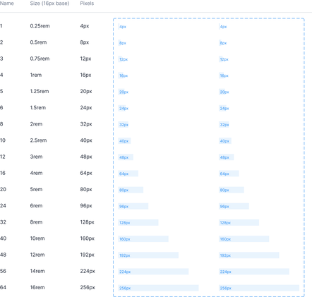
3.2.2. Spacing : 4 Point Grid System
-
Easily scale designs, create cleaner layouts, and have consistency across components.
-
spacing units are also synced to the asset library so designers can quickly switch between vertical and horizontal spacing.

4 COLUMN GRID
4 POINT SPACING
New design system has a defined set of text styles to choose from the side panel of design file in Figma.


3.2.3. Typography
-
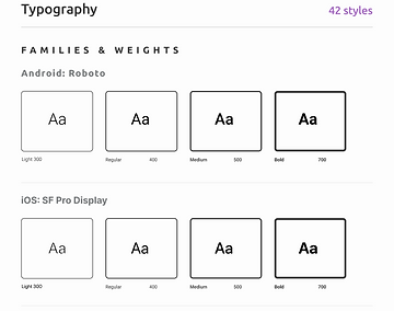
We’ve broken each text style down by name, properties, and where the style is used on the site.
-
We have used system fonts for Android & iOS which are SF Pro font family and Roboto font family respectively.
-
Here I have shown a glimpse of Styleguide and before & after of Figma file.
3.2.4. Colours
-
Colour styles are categorised into different categories as per usage in the application They are broken down into name, hex code, a swatch, which also shows where the style is used.

New design system has a defined set of colour styles to choose from the side panel of design file in Figma.


BEFORE
There wasn't defined colour style to keep the designers on the track & to maintain consistency. There were high chances of error in our designs

AFTER
Now we have defined colour style for each element and component. This will help to maintain consistency and eliminate any error.
We are also planning to experiment with using design tokens for each type and colour style in future as design tokens essentially add a value to style that can be pulled from a central location by developers for easier app maintenance and overall consistency from design to development.
3.3. File Organising
Each core guideline has its own page (shown on left sidebar).
Everything is labelled clearly and consistently.
All styles are synced to the asset library so designers can easily add/change styles (shown on the right sidebar).

4. Designing The Components
For the design part, we made sure that each of our components is Accessible, Intuitive and Aesthetic.
All components are made as variants of a parent component in Figma and utilise auto layout for scalability, consistency, and efficiency.
Organisation
-
Much alike to the core guidelines file organisation, the UI components file is structured to allow for easy maintenance of designs.
-
Everything is labelled clearly and consistently.
-
All styles are synced to the asset library so designers can easily add/change styles (shown on the right sidebar).
-
Each core guideline has its own page (shown on left sidebar).
Clear Hierarchy
We implemented a clear hierarchy within the file along with detailed specs and styles to account for any and all instances.


M O L E C U L E S
4.1. Basic Components
First, We moved on to the most basic elements such as Icons, Buttons, Input Fields, Check Boxes, Toggle Switches, Radio Buttons, Loaders, Controls etc. since these would be the building blocks that make up more complex components and flows.
Creating new components suddenly became simple because of the basic rules that we previously laid out. Every component that was added came with its own guidelines, specifications and behaviour based on any previous components it was made up from.
Each component consists of
Component Name
A specific and unique UI component name, to avoid miscommunication between designers and developers.
Component States
Recommended defaults and the subsequent changes in appearance. E.g.: Default, hover, pressed, disabled etc.
Notes (If Required)
Page annotations and descriptions to understand what component you were looking at.
Breakpoints (If Required)
Any size indication and breakpoints for the developers.
Example : Buttons

Button Details


Button States

Component Naming

Large
Medium
Small


This button is created without component library. We had to do all the changes manually. Like platform type, button type, state, size, input field etc. There were chances of creating inconsistent layouts
But, Now we have a dedicated library of components with all the use cases covered. We can just drag the component and make the desired changes within given properties.

BEFORE
AFTER
Here is a glimpse of some of the simple elements (Molecules) of the design system

4.2. Complex Components
-
The overall components are divided into Base components and main components.
-
Base Components are the basic individual components on the screens, whereas page components are group of components used on page and can be changed as per designs.
-
Everything is labelled with detail and consistency.
-
Each component style uses a template that clearly breaks down the various states, types, and sizes.


O R G A N I S M S
4.2.1. Base Components
-
Base Components are just like an Organisms in the Atomic Design System. They consists of Guidelines (Atoms) & Simple Components (Molecules).
-
Below are two examples of Base Components in detail to get a sense of how we organised and created them.
-
As shown in the template, each component type is labelled, built out as variants, and shown as specs on the title itself in the left panel.
Example : Input Field
-
For example, the input field component is divided into iOS and Android platform styles.
-
It is also broken down into Error, Hidden, Visible, Confirm etc; for Password input field as well as text input field.

This input field is created manually. There wasn't any option to change the component to different state easily. It was very time consuming.


BEFORE
But, Now we have a dedicated library of components with all the use cases covered. We have a complete control over the properties of this input field. You can easily change the state of the component in a fraction of a second.

AFTER


Try it :)
Example : Dashboard dials for scoring
-
The Dashboard dials component is broken down into various properties like number of segments, division of segments, colours on dials as well as dials for miles and reward points; clearly distinguished in their own sections.
-
It is also divided as per iOS, and Android platform designs.
-
Each of these alerts has 7 states with different score values as well as empty score dial.

Being one of the most important elements in our designs, it was very difficult to customise dials as per different requirements for different clients regarding its type, colours, score values etc.
But, Now we have a complete control over the type of dial that we want to use, the values of the dial, and scores as per the clients & designs' requirements.


Try it :)


BEFORE
AFTER

T E M P L A T E S
4.2.2. Page Components
-
Page Components are created as a separate page.
-
These are basically group of base components (Organisms), and are just like the Templates in the Atomic Design System.
-
These can be used while changing the content style of entire screen within similar screens.
-
An example of log In Form is given below showing various states of screens.
Example : Log In Form
-
The Log In Form is created using various states of Input Fields, which are part of the Base Components & Simple Components (Molecules and Organisms in Atomic Design respectively).
-
The entire form can be changed into different states like Default State, Error State and Confirmation State.

We used to edit the each and every form field earlier as per the requirement. There wasn't any flexibility while changing form fields and other items in the form.
But now, we have complete control over this situation and the type of form can be change within seconds without wasting any time and energy.

Try it :)


AFTER CREATING PAGE COMPONENTS LIBRARY
Example : Trip Summary Card
-
The Trip Summary card has various states like default card, extended option, editable option, with & without title option, with & without CTA option etc.
-
It is also divided as per iOS, and Android platform designs.
-
Try changing properties to see the details.
Try it :)

Changing and customizing all the cards that we have in our design has become so easy because of our component library. Earlier, it used to take so much of time.
But now, we have complete control over the formatting of our cards. We have made it truly customisable.


AFTER CREATING PAGE COMPONENTS LIBRARY

P A G E S
5. Design Pages
-
Pages are our final design screens.
-
we have created different sections for iOS, Android and Website design.
The Design System Encompasses Various Essential Elements
STYLE GUIDE
Defines Grids, Spacing, Typography, Colours & basic visual elements for a consistent identity.
COMPONENT LIBRARY
65+ reusable UI components, Saving time, money and effort in the design & development process.
DOCUMENTATION
Comprehensive resources for onboarding, guidelines and best practices.
Here are few things that I learned
-
Building this design system took a lot of time and there was a lot of back and forth. But it was definitely worth the effort. It has significantly improved our workflow, consistency across our products, and collaboration across the organisation.
-
I was able to collect lots of inspiration from different resources all over the internet. Collecting different UI kits and also using different design systems helped me a lot.
-
Getting everybody on the same page and working together as a unit, coordinating between designers, developers, and other stakeholders is very important. Everyone must be on the same page and work cohesively as a unit to function effectively together.
What's Next?
-
The design system will continually evolve as we re-evaluate the application’s needs and user’s needs. Along with helping streamline design for IMS One App, the design system allowed us to create a better user experience across the app.
-
This is in large part due to cutting out components we don’t need and being as lean as possible with what’s needed. This forced us to create rules around components, helping create more intuitive patterns for users on the app.
-
We especially want to find the best way to incorporate design tokens for a seamless design to development handoff.
-
Design systems are fascinating and I’m keen to learn more about them and the impact they make in product design.
Future Scope For The Design System
-
How might we implement design tokens?
-
How might we continually gather user feedback on the application to validate the UI component designs?
-
How might we find even more ways to streamline and organize the design system?