top of page

Boosted User Engagement Through Rewards Program
FOR IMS : ONE APP
Improved user engagement, business metrics and incentivized safe driving behaviour using telematics application.

B E F O R E


B E F O R E
A F T E R
Helped to Boost user engagement & loyalty for 350+ partners & Improve driving behaviour of 6,00,000+ users.
Overview
-
IMS is a product-based company providing insurance and mobility solutions through their One App, available on iOS, Android, and Web.
-
In the One App, we already had the rewards program which was helping us in the customer engagement and improving their behaviour.
-
But it was not good enough in terms of Layout, User Experience and Functionality.
-
So, our team was asked to redesign the rewards section and I was put in charge of the design together with my design lead.
My Role
Lead the project as a UX Designer
Project Duration
12 Weeks
Tools Used
Figma , Miro, Zeplin, Jira, MS Teams
Company
IMS (Insurance & Mobility Solutions)
Problem Statement
Redesigning the Rewards Program:
Enhancing the existing Rewards Program in the IMS One App to boost User Engagement, Improve the Driving Behaviour and Improve Business Metrics.
Our Primary Goals
Improving Customer Engagement
Motivate users to actively participate in the rewards program
encourage them to check the app frequently to track their progress and explore available rewards.
Incentivize Safe Driving Behaviour
To encourage customers to improve their driving behaviour so that they can see that doing so benefits them directly.
Enhance Customer Satisfaction and Loyalty
Create a valuable and rewarding experience for users.
Fostering positive feelings towards One App and IMS.
Collaboration
-
I led the project together with the head of design.
-
Scheduled weekly stand-ups to brainstorm ideas and track the progress
-
I also collaborated with a cross-functional teams throughout the process, including Business Analysts and Customer Care Team.
-
UX Designer (me), 1 Head of Design, 1 Product Owner, 1 Product Manager, 1 UX Copywriter, 1 Business Analyst, Customer Care Team and few Developers were a part of the team.

Business & User Impact Of The Project
88%
users checking their scores weekly
30%
increase in user engagement & improvement in business metrics
42%
Reduction in accident frequency
The Design Process
RESEARCH
CONCEPTUALISATION
DESIGN
1. Conducting In-Depth UX Analysis to identity major issues
-
Doing User Research : Collaborating with customer care team & Business analyst.
-
Competitor Analysis.
-
Auditing existing rewards section & user flow (Heuristic Evaluation).
1.1. User Research
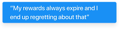
What our customers are saying?
We collaborated with Customer support team and business analyst.
-
We send out periodic surveys every now and then to our customers and we got some recurring feedback.
-
These surveys help us identify areas where we can improve our services and address any concerns that our customers may have.


User Research Findings
-
Users don’t find rewards page useful.
-
Users Finds it difficult to access the rewards section.
-
Users often lose their newly earned rewards.
-
Users don’t understand some terminologies used in the rewards section.
-
Users don’t find enough information about rewards & how to use it.


1.2. Competitor Analysis
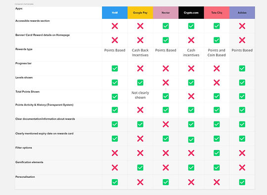
To understand the functionality and UI/UX of the rewards program, I shortlisted some names of indirect competitors, which I have had a direct experience with, and which has a point based rewards program. These include: HnM, Myntra, Tata Cliq, Adidas.


Findings to consider
-
Easy accessibility.
-
Use of multiple entry points.
-
Enhanced user guidance & improved error prevention.
-
Use of meaningful and relevant visual aids.
-
Clear documentation.
-
Personalisation.
1.3. Auditing Existing User Flow
Heuristic Evaluation
It involves assessing the design against a set of recognised principles to identify potential usability issues or areas for improvement. For this I collaborated with the head of design.
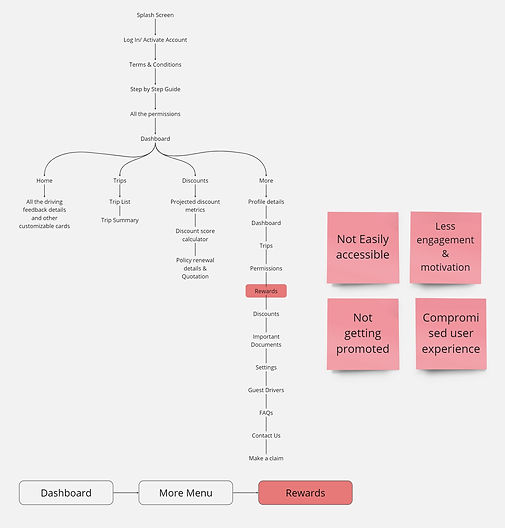
Top Level Architecture Analysis
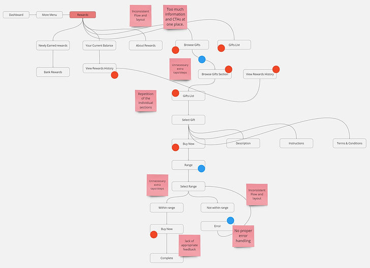
Rewards Section Flow Analysis
Findings after auditing the flow
-
Not easily accessible.
-
repetition of the sections.
-
Too much information on main page.
-
Too many CTAs at one place.
-
Use of internal Jargons.
-
Inconsistent flow & layout.
-
Missing information.
-
Complex user low.

Heuristic Evaluation & analysis of Screens
2. Overwhelmed with insights, we needed to start prioritising to form a strategy. This includes:
-
Defining the project.
-
Goals and focus areas.
-
Constraints and limitations.
-
Key strategic decisions.
2.1. Creating 'How Might We' Statements
HMW remind users about their rewards in a timely and unobtrusive way?
HMW keep our customers motivated and engaged on our platform?
HMW provide a clear and concise overview of the rewards section?
2.2. Deciding How would Rewards Program Work?
-
We decided to keep the existing rewards type and overall functioning same and focus was to improve the user experience and UIs.
-
Straightforward and accessible rewards: have been shown to engage policyholders and progressively improve driving habits.
-
Rewards that are frequent and ongoing have better long-term success with policyholders—and are more effective at changing behavior—than infrequent or one-off rewards.
2.3. Constraints & Limitations
Reward Limits
Due to technical constraints and company’s existing policies and budget constraints, customers can only receive one type of reward and the frequency of which depends totally on the driving behaviours and engagement of the users.
Scalability
This feature, to be rolled out across different ‘white label’ brands (Our Clients), require a design that prioritize simplicity and scalability to avoid complex logic systems.
2.4. Key Strategic Decisions
UX Requirement
-
Provide multiple, easy to find entry points for showcasing rewards as well as clear progress indicators.
-
Ensure rewards are simple to access and redeem.
-
Highlight the rewards which are about to expire.
-
Provide detail information regarding rewards and how to claim.
Top Level Architecture & User Flow
After our initial research, some critical decisions regarding user flows, placement of features and accessibility challenged me to weigh different factors and consider the impact on the overall user experience and the existing app layout and design.

BEFORE


AFTER
3. Once we finalised the flow & UX requirements, we started designing right away.
-
Conducted design exploration to create great visuals.
-
Brainstormed & Generated Ideas.
-
Continuously collaborated with development team and inspected the designs after every sprint.
bottom of page